Friday 16 October 2015

Things That Inspire Me

Elon Musk, Tesla and SpaceX


Elon Musk, co-founder of PayPal and CEO of Tesla, SpaceX and SolarCity is a huge part of what inspires me. His attitudes and actions towards the advancement of humanity, particularly regarding sustainable energy and Earth and Space based travel, plays to my deepest interest and motivations. He has vision and courage, and the craziness to change the world. 


Another Escape


A book series after my own heart, Another Escape is a creative adventure magazine which features outdoor lifestyle, sustainable living, creative culture and turquoise blue spines. Pretty much sums me up. I live in Northumberland National Park, so trees, mountains and stars are a big part of my life. 


Google, Apple and Microsoft 


Microsoft, Apple and Google are changing the world in a way which so far has improved it. They develop solutions and products that enhance our daily lives, and they ultimately aim to improve the lives of those who need it. As a group they're collectively trying to mitigate climate change, fight poverty and bring people together. 


Behance


Behance is the ultimate source of creative networking and work sharing. Its home to a huge range of graphic design, photography, illustration and creative direction. I use it to stay up to date with the best and trendiest design. 
https://www.behance.net/nickyhope2013


Computer Arts/Creative Bloq 


Computer Arts is my favourite design magazine - I buy it every month and have done for over a year. It's best for keeping up with contemporary design trends and getting insights into the industry and how some of the best graphic designers operate. 
http://www.creativebloq.com/

Instagram


Instagram is full of designers, photographer and inspirational people who share their everyday lives and their best work. It's a great place to browse and get inspired, and keep up with my favourite designers and inspirers. https://instagram.com/thefuturist343/


BlackBerry


I love BlackBerry. I love that they're still weaving away making amazingly unique and brilliant phones whilst most people have forgotten all about them. I love their design, their vision, their courage and their craziness. Crazy and fascinating (and really advanced) new BlackBerry phones inspire and excite me every time I use one. 


TED Talks


The very nature of TED Talks is to inspire. Some of the best designers, artists, scientists, musicians, writers, etc. convene here to inform and inspire us. I saw a particularly good one on vexillology a few weeks ago. 


Tobias van Schneider 


One of my favourite graphic designers, Tobias is a German born designer living in New York City. He's the Lead Product Designer at Spotify, and has worked for Wacom, Audi, BMW, Google and Toyota. He never went to design school, and he has a very interesting and inspiring private mailing list which I read every week when I receive it to keep up with what he's doing and any advice he has. http://www.vanschneider.com/ 


Video Games


I love video games. I love fantasy games, I love space games and I love war games. I love getting lost in a world different to that which is mine because it allows me to live like someone else, and, for a short amount of time, escape my own life. It's very hard to explain what it's like being immersed in another world. I'd love to work for a AAA games studio. 

Mac OS Wallpapers


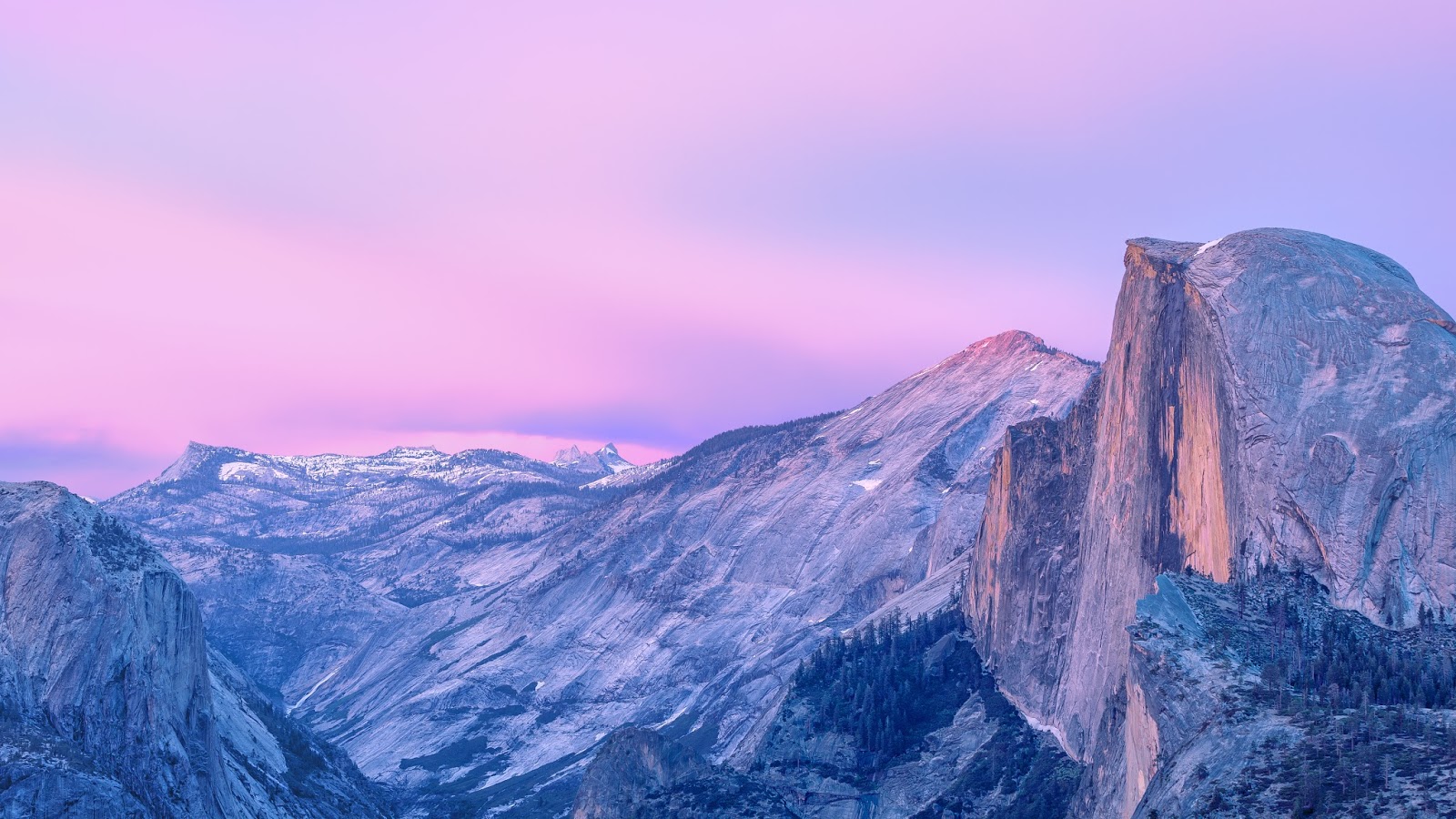
It sounds extremely odd, but the batch of wallpapers included in OS X Mountain Lion, Yosemite and El Capitan inspires me every single time I look at my desktop. They're beautiful, epic, natural scenes that make me want to pick up my camera and run. 

Tuesday 13 October 2015

The Role of Graphic Design in Transitioning Humanity to a Spacefaring, Sustainable Species (work in progress)


Tesla and Space X acknowledge the role that graphic design and design in general has in affecting public opinion and advancing certain products or services. Tesla was born out of the realisation that electric vehicles would never become the norm if they weren't designed in a way that made them better or at least equal with their fossil-fuel based equivalents. Through this realisation, Tesla proceeded to design and engineer a car that was designed to be as physically attractive as most high end luxury sedans, and to perform even better. 

SpaceX could be said to employ graphic design as a means of legitimising some of their operations by making them appear well-orchestrated and advanced. Tesla's logo has a sharp, red appearance reminiscent of Ancient Japanese art and design, giving it a wise and almost philosophical feel. It's precise, mechanical and considered, like a Ninja. Their identity as a whole is more contemporary Western, combining clean sans-serif type with dramatic and emotive imagery. It convinces us that their product is something not only for personal improvement, but for the greater good. 

Whilst putting a good logo on a product doesn't make it a good product, it certainly makes us expect that it is a good product. In Tesla's case, a good product is simply complemented by good design (but no marketing), and because of this the EV industry has exploded. Sales have become formidable, and rival car manufactures have announced intentions to release electrical vehicles themselves. This has greatly furthered EV research and advancement, precipitating humanity's transition to fully electric transport. And graphic design played its part in it. 

Additionally, a working combination of graphic design and glossy filmography makes rocket launches and craft tests more appealing to a wider audience. Traditionally, your average modern person may not be particularly concerned about a reusable rocket booster test, but they're more likely to be concerned if it's presented like this: https://www.youtube.com/watch?v=ANv5UfZsvZQ.

Saturday 10 October 2015

12 Graphic Design Studios

Studio AHxHA


Studio AH—HA is a communication & graphic design studio established in 2011 by Carolina Cantante and Catarina Carreiras. They're Lisbon based, and create personal, tangible work and independent projects. They like unique basic shapes, minimalism, and tend not to use primary colours. They have a large, broad clientele, and the studio started as two friends who got together, travelled the world and decided to create design as one.


Hey Studios


Founded by Veronica Fuerte in 2007 and based in Barcelona. Started as an online shop selling t-shirts, and they now do branding, illustration, and signage. They like the use of bright colours and bespoke, beautiful typography. They believe in doing everything on paper first, then going digital. Only 3 designers in the studio, which allows them to create a close relationship with their clients (who are often high-profile). They believe Hey Studios has an attitude, not a style. 


Sagmeister & Walsh


Team of 4 working from New York. Founded by Stefan Sagmeister, later joined by Jessica Walsh. Very famous group with work in illustration, advertising, signage, web design print and animation. 


Hey Days 


Norwegian agency based in Oslo. Identities and solutions for wide ranging clientele. Very good UI/UX. Network of wide ranging creatives, focus on logos, web design, UI. Challenge and establish the truth, and love minimalism and Scandinavian design. 


Lust 


LUST

Studio founded in 1996. 16 employees, based in the Netherlands. Emphasis on traditional print based media, book design and abstract design. Sub studio called LUSTlab, which, according to their website: "LUSTlab researches, generates hypotheses and makes unstable media stable again. According to LUSTlab, the future of digital media lies in the design of its use. Humanizing the unhuman, bringing the internet down to earth and finding the missing link between the digital and the physical. The outcomes vary from (strategic) visions to new communication tools, man-machine installations and physical products using digital content."

Studio Dumbar


Dutch studio founded in 1977. Third most awarded design studio outfit behind Apple and Pentagram. Offices in South Korea and China, and their Dutch studio is an unused electrical facility. Focus on strategy, comms, branding, process management, abstract, geometric, complex typography, digital distortion. "Our style is that we don't have a style".


Build 

Build

Originally based in London, now based in Yorkshire with an international presence. Founded in 2001. High profile clients - branding, type orientated, simple, muted palette. Set up married couple with a love for flat design. 


Elmwood


"The world's most effective brand design consultancy". Began in Leeds - current and historical effectiveness. Won the International Design Effectiveness Awards more times than any other studio. Created their own design tools. Own tea and beer brands, have sustainable ideologies. Offices in London, Singapore, Hong Kong, Melbourne, Leeds. Branding and packaging emphasis. 


Bleed


Offices in Oslo and Vienna. Multidisciplinary design studio - identity, art direction, company culture, created using form. Well renowned clients. 

Face


Face.

Mexican supermodernist studio. Brand production, founded in 2006 by Rick and Ricardo. 10 creatives now. "Simplicity Works". Honest branding to stand the test of time. 

Dessein 


Founded in Australia, 1987. Signage, web, packaging, illustration etc. "Effective, clean, clear, fresh, modern, colourful and contemporary". Korean designers, Italian, Indian; multiethnic. Inclusion inspires innovation. Won a lot of awards. 

Wolff Olins 


Founded by Michael Wolff and Wally Olins. Headquarters in London, offices in Dubai, San Francisco and New York. Created logos for 2012 London Olympics, EE, The National Lottery, Skype, 

COMMON TRENDS 


Small, close knit studios allow clients to feel as if they're getting more attention and have a closer connection with the designers. 16 people is the maximum number of designers in the above studios - historically, studios have had many more employees. Design identities are all relatively similar, follow trends. Full Service Agencies are now more common and tend to be more successful. Brag about awards. Showcase personal and concept projects, not just commercial ones. 


Thursday 8 October 2015

An Appreciation of The Martian's Art Direction


The Martian's art style is a dream for anyone interested in both graphic design and space exploration - it harmoniously combines the realistic with the visually dramatic, and pays homage to NASA's actual graphic design history. Above is an image taken from a user interface design within the film, and below is an actual user interface taken from an actual NASA rocket launch. The difference is clear and obvious - the film UI looks nicer. It's debatable whether the improved aesthetics of the film UI would make a positive or a negative impact on its usability as a system, but almost everything else about the film version is an improvement. Instead of squashed, unequal aspect ratios and bland black backgrounds, we have a perfectly proportioned grid system, much more interesting and in-depth 3D models, beautiful typography and smooth blue gradients. 

There is a point to this observation. Some people argue that not everything has to be 'designed', or that not everything can look pretty, but if a few large screens showing a lot of maths and physics can be turned into a work of visual art, I'm not sure there's anything that can't. 


It's also worth appreciating that the film's graphic design team chose to use both the original and the temporary redesign of NASA's logo. The original blue logo, seen on the left, was designed in 1959 as the first official logo of the agency. The red 'worm' logo seen on the right was a redesign done in 1975 as part of the US government's attempt to improve its departmental visual identities. It served to replace the blue 'vector' logo, but in 1992 the new director of NASA retired the worm logo and went back to the blue vector logo, in what was seen by many as a terrible step backwards and a disservice to the masterful craft of the worm identity. In The Martian, whilst the NASA logo used is the blue vector, the typeface that's used on the uniforms and the EVA suits bears a striking similarity to that seen on the worm logo. So in a subtle but distinct manner, both logos manage in some way to make an appearance.